Monday 29 November 2010

My Landscape Paintings Lack Drama or Depth

The landscape artist may feel in awe of a particular landscape scene, but the drama fails to convey to the oil painting; mountains look flat, waterfalls resemble a trickle and mighty firs look more like Bonsai trees. How can the artist produce a landscape painting with depth and drama?

Problems with Dramatic Landscape Art


Dramatic Landscape Art
Rachel Shirley
The following culprits are often to blame for a landscape painting that looks rather pedestrian rather than wild or dramatic:

Painting from memory elements that are missing from visual resources. This temptation may be borne from using mountains as a backdrop or a tree to conceal a mistake. Working from memory is the enemy of realism and may rob all drama from the painting.

Sitting too close to a painting, misleading the artist on the importance of each brush mark as it is viewed close up. Fine detail may not be so visible from ten feet away, resulting in a painting filled with insipid brush marks that lack punch or expression.

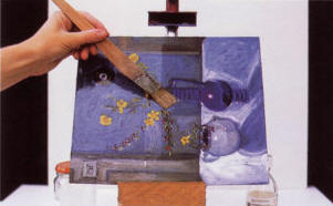
Painting onto a white canvas which may also mislead the artist to the true tonal value of each colour mixture, as even pale ones will appear dark. The result is a landscape painting that looks washed out.

Over-mixing the paint and applying it onto the artwork rather like one would to emulsion a wall. Similarly, anguishing over every brushstroke and smoothing over imperfections. The result is a painting that looks overworked and lifeless.

How to Paint a Dramatic Landscape

Adding a sense of depth and drama to a landscape painting is mostly dependent upon the visual resources at hand, whether this is photos or sketches. Painting from memory must be avoided, or it will spoil the effect. The following tips will help create a landscape that has depth and drama.

Fine Art Photography

If panorama is desired, select an image that contains distant objects and near objects. The contrast in proximity will enhance the sense of distance, whether the scene depicts a Scottish Highland or Yellowstone Park. Using wide angled photography provides further opportunities for exploring big skies and vistas adding a real sense of space. Be aware of the horizon line. A high horizon will enhance the land; a low horizon will enhance the sky.

Furthermore, don’t clutter the landscape with lots of elements. Less can often be more when it comes to creating a grand scale.

Look for and create contrasts within the landscape scene: Big and small; sunlight and shadow or near and far. A small cottage will make a thundering waterfall appear more impressive. A lone poplar set against distant mountains will create a chasm effect. A streak of sunlight hitting a snow cap against a sombre scene will create a tonal focal point.

Painting Dramatic Skies

Landscape Perspective
Rachel Shirley
Beware of empty skies that exhibit a lacklustre blue or grey. If a photograph features such a sky, another sky can be substituted so long as the lighting, angle and the time of day are consistent. Great skies to use might be altocumulus, anvil clouds or frontal cirrus. Further drama can be added if clouds are obliquely lit by a low sun, bringing bizarre colours and textures.

An ordinary landscape can be transformed by different weather conditions. Castlerigg Stone Circle in Cumbria, for instance has twice the drama when snow-caps festoon the surrounding mountains. Consider returning to the same setting another day or time of year.

How to Create a Spacious Landscape

Fill Your Oil Paintings with Light & Color
Tips for Landscape Art
click to buy from Amazon
A landscape even when empty adheres to the rules of perspective which can be used to add depth to a painting. Imagine for instance, that the landscape is the floor and the sky is the ceiling to a huge room. If both exhibited a grid, the squares would appear to flatten and get smaller with distance until the grid converges to a vanishing point. Clouds and grass echo this pattern, in that each formation would appear to flatten and get smaller.

This sense of distance can be further enhanced with tonal recession. Generally speaking, objects will appear more muted and faint with distance, particularly during misty weather. Look out for unlikely colours. Even a murky day may contain specks of crimsons and violets.
Painting Techniques for Dramatic Art

Stand back from the painting to prevent working too close up. Working on a toned ground as opposed to a white surface will help the artist judge tones more accurately. I endeavour to use all tonal values from pale to very dark within my landscapes. Don’t be afraid to use paint neat from the tube and to contrast art techniques, from impasto skies to blending mists. Palette knives, old combs or sponges are great for creating a diversity of marks for a dramatic landscape. Lastly, don’t fret over every imperfection. Allow streaks of colour and brush marks to remain. Doing so will retain freshness, vibrancy and energy to the painting.

Links on Landscape Painting

Sunday 28 November 2010

Where do I Find the Confidence to Begin Oil Painting?

The beginner in landscape painting may find it difficult to pick up a paintbrush and make a mark. A fear of failure fuelled by an inner art critic could cripple all creativity before it has a chance to express itself into a sky sketch or a seascape. How can the novice artist produce satisfactory landscape art for the first time?

Creative Blocks to Landscape Art

Experiments with Paint
Rachel Shirley
Worrying about getting the first mark perfect could cause the artist to continuously false-start the painting in an effort to capture a particular green colour mix or realism in clouds. Unchecked, this inner perfectionist could sap all confidence from the artist, creating a negative learning experience. But there are easier ways of overcoming the transition between a non-painter to a landscape artist.


Painting a First Landscape

Learning a new skill often entails being lenient and landscape painting is no different. This means learning to accept that mistakes will be made, some of which may turn out to be “happy accidents.” Unintended marks may add interest to the landscape painting and could be used to enhance future artworks. Alternatively, every mistake is a learning process.

Starting Out in Landscape Painting

Begin with mark making on a primed piece of card. Use each brush and try out each colour in turn. Aim to cover the painting surface with different marks. Use paint neat, dry, runny or thick. Mix two colours, then three. Try blending two colours into one another to create gradations. Lighten a colour by adding white, then try darkening it by adding the colour’s opposing colour (in the case of red, this will be green.)

Experiment with how colours look when placed against different backgrounds. The artist will discover that a dark colour will appear pale when painted on a darker colour, and a pale colour will appear dark when placed on a pale colour. This is good practice when gauging the tonal key of a landscape painting, such as painting clouds on a blue sky, or shadows over water.

Expressive Landscape Painting

Try out different brushes, palette knives, old combs, toothbrushes or sponges. View oil painting like a child learning a new skill. Above all, have fun and experiment.

When producing a first landscape painting, keep it simple with manageable goals. Experiment in private if need be and bear in mind that if the painting does not work out, it does not matter for this is all part of learning.

Begin by using a limited palette of three primary colours and white. Use a small painting surface of approximately A4 in size. Copy a photograph consisting of simple elements. This might be a sky, a tree, a river or a cottage. The aim is not perfection, but simply to complete a painting.

Tips for Beginners in Art

Resist the temptation to compare oneself with landscape art as seen in fine art books, such as those produced by the Impressionists or the Classists. Such comparisons will be unfair and could nurture an inner despair. Artists such as Constable and Monet could only reach the pinnacles they had by intensive practice fuelled by a passion for painting. Even they at some point would have produced an unsatisfactory landscape painting and made mistakes. Of course, fine art books continue to show only their best works.

Expressive Oil Painting Landscapes

Fill Your Oil Paintings with Light & Color
Create Colourful Paintings
click to buy from Amazon
Try not to agonise over every aspect of the painting in an effort to get it right. Landscape oil painting often means letting go. Allow imperfections to remain, which might be brush marks, streaks of colour or irregular lines. Oil Painting is often about suggestion rather than illustrating every object in full. Cloud sketches and lake paintings for example, often contain broken glazes and thick impasto, which adds atmosphere and expression to the painting.

Improving an Oil Painting

Completing one’s first landscape painting is a big first step and may spark the inspiration to embark on a series of others. A painting that does not go to plan can be put to one side and another one begun. But learning to paint involves learning to accept mistakes will happen, and with the right view, provides the path to improvement, whether it is to capture reflections in water or snow caps on mountains.

Links on Painting Landscapes

Tips on Painting Mountains without Resembling Traffic Cones

The artist striving for drama may paint mountains as a backdrop to a village or creek that resembles an idealised Alpine scene of pointed cones with cartoonish snowy caps rather than a convincing portrayal of mountains that suggests bulk. How does the landscape artist paint mountains with realism?

Problems with Painting Mountains

Oil Painting Mountains
Rachel Shirley
The following culprits are often to blame for an unconvincing painting of mountains:

Making assumptions about the appearance of mountains that harp to symbolism. This might be: all mountains have flanks that are angled at forty-five degrees; all flanks converge neatly to a sharp summit; all snow caps are white; all mountains are bluish-grey and the contours of all mountains are jagged, etc.

Painting mountains in isolation to the other elements of the landscape painting instead of keying them in. This might result in mountains that appear too faint, too dark or out of scale with the rest of the painting.

Using mountains to fill an empty space, to hide a mistake or provide a backdrop to a landscape painting. This might tempt the artist to paint the mountains from memory which could result in the aforementioned idealised portrayal of mountains.

Treating mountains as cut out shapes and filling them in with one hue. The resultant featureless slopes are unlikely to grant the viewer any of sense of depth or scale to the landscape painting.

Tips on Mountain Painting

In order to make improvements to a painting with mountains, all assumptions about how mountains “should” look must be dispelled. This means looking at mountains images, either in real life or photos with fresh eyes. The artist will soon discover that some mountains have bizarre outcrops, protrusions and cols, the contours of which could be jagged, smooth, curved or bulbous.

How to Paint Mountains

How to Paint Snow Caps
Rachel Shirley
Unlike buildings, painting mountains accurately is not so crucial, but it is important to capture the truth about mountains which can be found within their diverse textures, contours and patchwork of colours.

When brightly lit, mountains exhibit a weird and complex jigsaw of colour and tone. Some lower flanks resemble crumpled tissue paper; others undulate from a flat plain. In such cases, it is important to simplify the mountain form into its most basic elements first, and then to work into the detail.

Many mountains do in fact resemble inverted cones, but some might be lopsided, pyramidal or flattened. Build upon this basic shape by observing and adding other shapes to this basic shape to suggest a complex three-dimensional form. Compare one shape with another and record whether it is darker, paler, bluer or more crimson than a neighbouring area.

Half-closing the eyes will unclutter the scene and help the artist capture the basic essence of the mountain. Detail such as trees or ravines can be added last.

The Colour of Mountains

The same mountain will appear different under diverse lighting, weather and seasons. Autumn will exhibit pinks, reds and rustic colours from fern that on other occasions look bland. Grim weather will bring out slates, greys and violets that add drama. Snow caps exhibit arctic blues and creams if sunlit, creating focal points. Never disregard a colour if it can be seen on the mountain, regardless of how bizarre it might seem.

How to Paint Mountains with Drama

The Complete Oil Painter: The Essential Reference for Beginners to Professionals
click to buy from Amazon
Rather than view mountains as a convenient backdrop, use them as a focal point to a landscape painting. Dramatic photos of mountain ranges such as the Himalayas, the Alps, the Rockies or the Appalachians offer great opportunities to use bright colours and contrasting tones. Kilimanjaro or the Eiger are also worth exploration.

Oil Painting Techniques for Mountain Art

Any art technique can be used for painting mountains. Impasto oil pasted via palette knives will suggest thick snow and sharp peaks; blending over detail with a thin glaze will suggest mist over the mountains; or simply painting alla prima via wide bristles is great for expressing, energy and movement to a mountain painting. Applying detail via a fine sable is ideal for suggesting cracks, icy rivulets or pinnacles.

Links Relating to Mountain Painting

Saturday 27 November 2010

Understanding Perspectives in Buildings for Painting

Painting buildings for the first time may flummox the artist who struggles with vanishing points and perspectives, resulting in a village scene consisting of childish-looking blocks nestling in trees with black squares for windows. What is the best way to paint buildings?

Problems with Drawing Perspectives for Buildings

Perspectives to Buildings
Rachel shirley
Before making improvements to a painting consisting of buildings, the following culprits need to be identified.
  • Not understanding or adhering to the rules of perspectives, vanishing points or failing to measure proportions of buildings.
  • Illustrating every building as being a cuboid of equal sides and angles that fall away towards the distance in the same fashion.
  • Illustrating windows as being the same size and proportions, despite the wall they reside upon angling away from the viewer.
  • Taking the draftsman’s approach to illustrating buildings, measuring equal spaces between windows, centring doors, and using the ruler to draw lines for tiles, bricks or drainpipes.
  • Over-smoothing the paint on surfaces of buildings, resulting in a space-age looking village rather than one that looks natural or worn by time.
Simple Exercise on Painting Buildings

The following simplified drawing exercise may help the artist paint convincing buildings, whether this is a Lakeland village or Cornish tin mines.

Establish the centre of the composition, which could be a window or a roof tile. Plot this centre point onto the centre of the painting surface. Doing so will prevent the composition from falling off towards the edge of the painting.

Identify a “key” measurement within the composition starting with the biggest. This could be the height of a building or the width of a roof. This “key” may be used as a foundation from which to build up the sketch and make comparisons with other aspects of the composition. The church spire, for instance may equal or half this key measurement.

How to Draw the Vanishing Point

How to Draw Buildings
Rachel Shirley
Bear in mind that the horizon lays at eye level, whether or not it can be seen. Draw a faint line across the painting surface to represent the horizon. Remember that the location of the line will affect how much of the sky or ground will be in view.

If the wall of a building went on forever, it would eventually recede at a point on the horizon. This point is known as the vanishing point. Every building or structure has their own vanishing point.

Any aspect of a building, such as a porch or veranda that falls below this horizon line will generate an angle that will appear to recede upwards towards the vanishing point.

Similarly, any feature located above the horizon line, such as a rooftop or chimney stack, will generate angles that appear to fall downwards towards the vanishing point.

How to Sketch Angles for Buildings

Another rule of thumb is that a structure that is situated near the horizon line will generate a small angle; a structure that is situated at some distance above or below the horizon line will generate steep angles. This can be seen when viewing tower blocks from below.

Drawing Detail on Buildings

Contrary to belief, windows often are not spaced equally on a drawing, even though this might be the case in reality. If a wall recedes from the viewer, the spaces between windows, doors and other features will get smaller and appear more squashed together. Doors will appear narrower and chimneys thinner, including the spaces between.

Sketching Detail on Buildings

Oil Painting for the Serious Beginner: Basic Lessons in Becoming a Good Painter
Oil Painting Guide
click to buy from Amazon
All this being well, nothing can really substitute for sensitive observation. In many cases, buildings are not perfect right-angles and walls do not have crisp corners. Weather and time will create imperfections. Crumbling brickwork, crooked cottages and gates off hinges often add a charm and authenticity to a setting consisting of buildings.

The Colour of Buildings

Close observation also applies to the hue of buildings. Brickwork is often not a consistent and perfect red, but a medley of ochres, oranges, browns and maroons; similarly, mortar will exhibit blues, browns and rusts. Moss, pebbledash and sandstone will often possess a variety of tones. The weather and lighting conditions will further create unlikely colours on any building. Reflections from a blue sky or sunset will cast pinks or blues onto white cottages.

Finally, a successful rendering of buildings will result if making artistic comparisons between the buildings and other elements within the painting. Are the colours paler, more sombre or have a particular hue? This will ensure the buildings key in with the trees, river or sky nearby.

Links to Products and Articles on Oil Painting Buildings

Wednesday 17 November 2010

Should I Insure My Oil Paintings?

Art insurance is a must if expensive oil paintings are to yield compensation should damage or theft occur. Peace of mind is priceless whilst a valuable painting is in transit, hung in an exhibition or in storage. But what is the best way to get an oil painting insured?

Art Insurance for Artists

Art Dealer's Field Guide: How to Profit in Art, Buying and Selling Valuable Paintings
Dealing with Oils
click to buy from Amazon
Insuring an oil painting could be a wise choice for various reasons, namely:
  • Becoming an art collector and/or dealer makes art insurance crucial.
  • An oil painting that has been in the family for years may not only have sentimental value, but monetary value. The rule often holds that the older an oil painting, the more valuable it is likely to become, particularly if the artist is of some note.
  • An oil painting that has taken hours of painstaking work to achieve from the artist’s point may have personal value.
  • An oil painting that has won prizes, received critical acclaim from official sources, and has been widely published, reviewed or recognised.
  • An old oil painting may have been acquired from a house clearance, an auction or even (as in my case) from a car boot may have monetary value.
Insuring an Oil Painting

In the case of an old oil painting, a certificate of authenticity from an official antique dealer (a service that may also offered by a fine art insurance company) is vital. Specialised art insurance companies such as Loveart Insurance or Axa Art Insurance Limited might be the best option.

An oil painting that is not listed within Christie’s, Millers’ or Phillips’ books and schedules may only be worth the cost of the art materials to produce (the canvas, oil paint and the varnish). Thirty or forty pounds or so does not reflect the hours of labour to produce the painting. In such cases, a realistic appraisal of the oil painting’s value and itemising the artwork within the house contents schedule might be a better option.

Insuring Valuable Art

For costly art, extra diligence may be required. Photograph the artwork and keep copies within the insurance package. Record vital information about the painting, such as the dimensions, medium, style and the artist etc. Keep receipts, certificate of authenticity and any other paperwork pertaining to dealings with the artwork.

Very valuable oil paintings deserve as much insurance as possible. If the worst happens, and the painting is stolen, as least there is monetary compensation. Some is better than nothing, and the oil painting collector may use the cash to eek a little revenue from publicity, installing a security system or even offering a ransom for the painting’s return.

Cheap Art Insurance

How to Start and Run a Commercial Art Gallery (How to Start & Run a)
Make Money from Art
click to buy from Amazon
Read, read and read the insurance schedule. Ask questions and ensure that everything is covered. For instance, the schedule may insure the painting against theft, accidental damage, fire and flood, but what about the painting’s frame, which may also be valuable? Similarly, does the location of the painting have any bearing on the cover, such as damage in a public place? Omissions of the obvious can easily happen.

Adding valuable oil paintings to house insurance will often work out cheaper, particularly if the house has a good security system. Otherwise, using specialised antique insurance is worth paying out for if the oil painting is priceless, such as an old master.

Useful Links on Paintings

Tuesday 16 November 2010

Should I Get My Oil Painting Restored?

Acquiring an old oil painting or antique fine art may show signs of damage due to wear, tear and time. The temptation to do a DIY art restoration job may not be wise if the painting is valuable and could cause irreversible damage. What is the best course for getting the oil painting restored?

How to Care for Oil Paintings

Varnishing an Oil Painting
Rachel Shirley
Like most things, time will age an object, and oil paintings are no exception. Lack of care, damp, heat and pollution can all contribute to damage. Prevention is better than cure, but the following practices may have caused an oil painting to age rather prematurely:
  • Hanging the oil painting over a heat source such as a gas fire or radiator. The constant temperature changes and the drying effect could cause the paint layer to expand and contract, creating stresses. The result could be cracking.
  • Placing the oil painting near a window under an intense light source could cause some of the pigments to fade or discolour.
  • Storing the oil painting in a damp location could cause a fogging of the varnish layer due to condensation getting trapped between the painting and the varnish. Damp stains on the canvas may permeate onto the paint layer, causing tide marks or worse, the weave of the canvas to rot.
Varnishing an Oil Painting

A less serious problem, an old oil painting may dull over time due to the accumulation of dirt, dust and smoke in the atmosphere on the varnish. One need not worry, for this is the purpose of the varnish. After ten or twenty years or so, the varnish is supposed to be removed with a special varnish remover along with all the pollutants, and a fresh coat of varnish applied. It is only when the painting has been restored in this way that the colours jump out once again, as though freshly painted.

The temptation to over-clean should be resisted as this could damage the painting. Similarly, never try removing the varnish with an industrial varnish remover, spirits or abrasive agent. Special varnish removers for fine art are worth the investment.

Fine Art Restoration Services

The type of restoration required depends upon the nature of the damage. A particularly old painting, of prior 19th century may well benefit from the restoration by experts. Contacting an art restorer who is a member of the British Association of Conservator Restorers (BAPCR) is a safer bet. The following common restoration services are available:
Winsor & Newton Dammar Varnish for Oil Paintings 500 ml Jar (16.9 oz.)
Oil Painting Varnish
click to buy from Amazon
Oil Painting Cleaning: The most common and simplest of art restoration. The old oil painting varnish is removed by careful means and a fresh coat of varnish applied. An unvarnished oil painting may need cleaning via a different technique.

Canvas Repair: if there are holes, tears or scratches on the paint layer. In which case, the painting surface may need to be professionally patched.

Inpainting: a technique where damage to the paint layer due to peeling or cracking is restored. This entails building up the paint layer to its original state with carefully matched pigments and brushmarks. This is not repainting or over-painting, but replacing what is missing. Only specialist restorers should be commissioned to do such work, as matching pigments and the brushmarks of the original artist are painstaking.

Oil Painting Conservators

The best art restorers use minimum intervention to the oil painting, some using specialist in-house techniques such as micro-friction cleaning or composition lining. Micro friction is used for the removal of hard varnishes, where a controlled jet of small particles is propelled at the varnish to break it up for removal. All techniques used by a reputable art restorer should be reversible, meaning that the work can easily be removed by future restorers if required.

Information on Oil Painting Repair and Restoring

Monday 15 November 2010

My still Life Painting looks Uninteresting and Stilted

Part of painting a still life is setting up the objects. The beginner may agonise over the oil painting technique, overlooking the composition, which could contain jarring or unnatural elements that do not please the eye. What are the secrets to a great still life composition for painting.

How Not to Compose a Still Life Setting

Ideal Objects for Still Life Art
Rachel Shirley
Making changes is the key to making improvements to a still life painting, which often entails reflecting upon why the setting does not work. The following issues may need examination:
  • Artificial light or flash photography may make the objects look flat or cast an unwanted hue.
  • Not treating shadows as subject matter, resulting in shadows falling off the edge of the painting.
  • Placing two objects of similar shape next to one another, creating unwanted echoes within the still life setting.
  • Orienting objects with projections in the same direction. An example might be allowing a teapot spout and a cup handle to point at the viewer.
Not watching out for clashing colors which contain similar hues. Peach, beige and cream may collectively appear jaundiced; turquoise, cobalt and sage may look insipid.

Ineffective use of negative and positive space could cause lots of problems with the still life setting.

Negative and Positive Space in Art

Negative space is the area surrounding the objects within a painting or setting. The background can be seen emerging within enclosed shapes as well as around the objects, such as a cup handle. Positive shapes are the objects themselves. A good composition is one that contains similar amounts of negative and positive elements throughout the painting. Look out for too much negative space in one area of the setting, which may result in a lopsided composition. Adjust accordingly


A Natural Still Life Composition

Making the arrangement of objects look natural is the key to an effective still life painting, but this is not easy to achieve. Expect to spend half a day or so moving the objects around. Looking at grouping of objects in everyday life may help the artist find the aesthetic in the mundane: disregarded children’s toys, a row of plant pots, used shed tools or cosmetics on a dressing table.

The Best Objects for a Still Life

Contrasting objects will create focal points within a still life. Contrast may mean color, tone or texture: soft and hard, rough and smooth, bright and dull, or curved and straight. An ideal grouping of objects could be a broccoli, a glass tankard, an eggcup and a brass ornament. Each contrast with one another in terms of color, tone and shapes, and also provide opportunities for the artist to explore shadows, reflections and distortions through glass.

Never disregard any object for a still life. A NatWest piggy bank, a teddy bear or a crocodile skin purse are all potentially interesting subject matter. Taking an object out of context will force the observer to see an otherwise mundane object in a new light.

Lighting for Still Life

Consider shadows as part of the still life subject matter. To the eye, shadows have shapes, hues and outlines, just like the objects themselves. If a lamp is at hand, try moving it around to see how the shadows stretch out, shrink and shift about. Look at how they fall over neighbouring objects and how the outlines differ. Natural light is often best. I favour placing my objects next to a sunlit window. Backlit, side-lit and front-lit present different challenges and create their own brand of light and shadow.

Ideal Backgrounds for Still Life

Always take consideration over the background in the painting. Pale objects may contrast nicely with a forest green or indigo cloth. A wooden jug can be brought out with cream or pale blue. But the background does not have to be the same color all over. A streak of sunlight falling over the wall or part of a window will inject a sense of space to the still life.

Great Still Life Art

Still Life Painting Atelier: An Introduction to Oil Painting
Still Life Art Book
click to buy from Amazon
A good still then, is one that contains contrasts in objects, and great use of lighting to bring out form. Taking objects out of their normal context will make the viewer see the objects in a new light. Making the setting appear natural is not as easy as it looks. Some artists spend hours setting up a still life. If things do not work out, leave the objects where they are (use chalk marks as a reminder to their positioning if they have to be put away) and leave for a week or so to gain a fresh perspective.

Helpful Links on Still Life Oil Painting

The Objects in My Still Life Painting Look Flat

The still life artist may encounter problems with making objects look three dimensional. Vessels look flat, shadows look like holes and the fruit do not appear to inhabit three dimensional space. How can the artist paint a still life that suggests weight and mass within the painting?

Common Problems with Painting a Still Life

Tips on Still Life Art
Rachel Shirley
A still life often contains a diversity of objects, with different forms, textures and hues. In such cases, any manner of things could go wrong with a still life, but here is a list of the most common issues with still life painting.

Objects with ellipses such as vases, cups, urns, saucers, eggcups, teapots and wine glasses can be a real headache for novice artists, as the ellipses follow obscure rules. Ellipses are such a common problem I have dedicated a separate article to it.

  • Reflections on shiny objects and distortions through transparent items such as glass may end up looking muddled due to confusion regarding reflections, shadows and refractions.
  • Expressing shadows as black with defined edges, making the still life painting appear to contain “holes.”
  • Allowing the light source to fall directly onto the objects, making them appear flat.
Still Life Objects in 3D Space

The beginner will benefit from keeping the still life setting simple, consisting of three objects or so. Glass, fruit and china presents different challenges for the artist when it comes to reflections and distortions. In such cases, forget what the objects are and break the setting down into an abstract jigsaw of shapes and colors. More about how to paint glass and reflections can be found on a link at the foot of this article.

How to Make a Still Life Look 3D

Placing the objects near a window and orientating the setting at ninety degrees from the light source will create an interesting interplay of light and shadow over the objects. Look out for odd-shaped shadows that pool over the table or over nearby objects.

How to Paint Shadows on Objects

One of the secrets to recreating form in still life objects is reflected light. Reflected light is light bouncing from a reflective surface into areas of shadow. Reflected light may illuminate shadow with many colors, including violets, blues or creams.

Bizarrely, the darkest part of an object is not always the part that points directly away from the light source, but an area that avoids that light and the reflected light. If this sounds complicated, take a look at my painting of the pestle and mortar. Streaks of light can be found within the shadowed area. This is due to light bouncing back from the illuminated table. Looking out for reflected light will create an effective still life study of objects.

Oil Painting Techniques for Shadows

Shadows are not just black, but contain different colors, as in the case of reflected light. Rather than darken the color of terracotta with black for example, darken it with the opposing color. Terracotta being red can be darkened with a bluish pigment. Look out for other unlikely colors in shadows. Sensitive observation will also reveal that the outlines of shadows are not always definite, but can be blurred. The same rules apply to highlights, which are not always white and can take on different forms.

Guide to Still Life Painting

Sitting too close to the still life painting for long periods will often lull the artist into a sense of complacency. Standing back will provide a rude awakening to hidden issues. For this reason, it is always wise to stand ten feet away and to compare the composition with the artwork. Turning the painting upside down or viewing it through a mirror will reveal hidden errors.

Techniques for Oil Painting a Still Life

Classic Still Life Painting: A Contemporary Master Shows How to Achieve Old Master Effects Using Today's Art Materials
Still Life Painting Techniques
click to buy from Amazon
A combination of glazing oil paint and detail can be used to illustrate delicate shadows within a still life oil painting. Begin by simplifying the areas of light and shadow into basic blocks of color and tone. Half closing the eyes will cut out irrelevant detail. Don’t forget to look out for reflected light.

Apply the paint as though it will be the final layer and let it dry. Don’t worry about imperfections; a subsequent glaze of oil paint can be used to smooth these out. A soft sable or rag is ideal for creating smooth gradations in paint. A further glaze can be applied, and if necessary, neat paint for illustrating highlights and for neatening selected areas.

Links to Further Advice on Still Life Painting

Thursday 11 November 2010

I Don’t Like the Smell of Oil Painting Mediums

The prospective artist may purchase an oil painting kit that contains smelly solvents that could cause irritation to the nostrils or skin. This may put off artists who suffer allergic conditions. However, there is a way of practicing oil paint that is friendly to the environment as well as the skin.

Odourless Oil Painting Mediums
 
Oil Painting with Water Soluble Oils
Rachel Shirley
Several options are available to the artist who is loath to powerful odours. Although oil painters are known to use Turpentine or white spirits to produce oil washes or to clean the brushes, such industrial cleaners should be dispensed with, as they strip the natural oils from the art brushes and make the room an unpleasant place. Low odour art mediums that are kinder to the environment as well as the skin are more suitable, such as:
  • Low odour artist’s white spirits.
  • Turpenoid.
  • Sansador.
Lathering oil painting brushes in neat washing up liquid or soap after cleaning in artist’s spirits will prolong the life of the brushes.

Water Soluble Oil Paints

Another option is to use watermixable oil paints. Winsor and Newton’s Artisan or Royal Talens’ Van Gough H2Oil are two examples of oil paint that is soluble in water (watersoluble oil mediums are explained in depth in another article). The properties of watersoluble oils are the same as traditional oil paint, the difference being that the oil medium has been modified so that it breaks down in water. This may make some oil painting purist shudder at the thought of oil and water mixing, but watermixable oils are widely used and are effective.


Water Mixable Oil Thinners

Artisan has a range of forty colors and its own versions of oil mediums to suit. Of course water can be used with Artisan to produce washes, but should be added gradually or the paint might bubble. But because water evaporates quite quickly, the watermixable oil paint is prone to thickening rather too quickly on application, making manipulation a little tricky. To overcome this problem, Artisan’s water mixable oil thinner provides a more oily consistency to the oil paint, making oil painting more like its traditional counterpart.

Water Mixable Oil Mediums


Winsor & Newton Artisan Water Mixable Oil Colour-10-21 ml tubes
Water Soluble Oils
click to buy from Amazon
It is wise not to use traditional oil and watermixable oils in the same painting, as the differing drying rates could cause stresses in the painting. For this reason, Artisan has developed watermixable equivalents to the traditional oil mediums. For modifying the oil paint, water mixable linseed oil, water mixable safflower oil, water mixable stand oil and water mixable impasto medium have been developed. Some of these mediums will retard the drying time of the oil and add a glossy finish, others will accelerate the drying time.

Varnishes for Water Mixable Oils

Specialised varnishes have been developed for water soluble oils. Again, Artisan varnishes contain no irritants and are odour free, as the varnish is watersoluble. Gloss, matt and satin finishes are available. The varnishing brushes can be cleaned in warm soapy water afterwards.

Odour Free Oil Colors

The artist who suffers allergies or who dislike the high odours of oil mediums may try traditional oils with low odour artists’ spirits, but water mixable oils are a popular choice for artists who wishes to avoid traditional oils altogether.

Advice on Alternative Oil Mediums

Wednesday 10 November 2010

How do I Paint Ginger Hair in My Portraits?

Painting a portrait of someone with red hair may spur the artist to reach for orange or red oil paint in the belief that the pigment will closely resemble the color of red hair. The result is likely to be a garish color or a carroty hue that fails to convince. What oil pigments can the artist use to paint realistic ginger hair in a portrait painting?

Portrait Painting with Red Hair

How to Paint Red Hair
Rachel Shirley
The portrait artist may review the problems that have occurred during the portrait painting of someone with red hair to achieve realistic ginger hair. The following issues may need addressing first:
  • Using any red oil pigment at hand to express red hair because both have the same color label.
  • Using the “one size fits all” approach to the colour of red hair and using the same color mixes for anyone with ginger hair.
  • Darkening the color of ginger hair with black for darks, resulting in dirty colors.
  • Expressing highlights found in ginger hair by simply introducing white to the red color, resulting in unwanted pinks.
  • Not suggesting any variation in the tone or thickness of the red hair at the hairline, the result being that the hair appears to “bleed” at the scalp.
  • Not thinking about the background to the portrait of someone with reddish hair, with the possible result of clashing colors.
How to Paint Realistic Ginger Hair

Sensitive observation is the key to producing a realistic painting of red hair. Good photographic reference will also help. Flash photography will make the hair area look flat or create an unwanted cast. Artificial light in particular could create a jaundiced hue. Natural daylight is best.
  • Dispel preconceptions about the color of red hair. Violets, blues and creams can often be seen in red hair.
  • The thickness of ginger hair often varies between crown and scalp. The best way to suggest this variation is to mix a little flesh color with the red color at the hairline, and then to apply a little detail over this pale color. Fine strokes from a thin sable would be ideal. Sometimes, the color will vary on one strand of hair.
  • Avoid using black with red. It is better to introduce a little complimentary color to the ginger mix to darken it. In the case of a red color, this will be blue or violet.
  • Look out for unexpected hues in highlights. Depending upon reflections or the lighting conditions, blue or purple can be found in highlights.
Take care to select the most suitable background for a portrait with ginger hair. Avoid peaches, pinks or yellows, which could clash. Dark, cool colors will compliment the subject matter. Forest green, midnight blue or rich earths will bring out the red color of the hair.

Hair Color Ideas for Portraits with Red Hair

Painting Beautiful Skin Tones with Color & Light
click to buy from Amazon
Red hair can encompass a wide array of hues, from honey to auburn. The secret to capturing reddish hair in a portrait is close observation, as discussed earlier. However, portrait painters may use the following color mixing guide for the base color of a particular red hair shade. The following list begins with the largest quantity first.

Auburn or chestnut hair: burnt umber, a little permanent rose, burnt sienna and white.
Very red ginger hair: Cadmium red, burnt sienna a little burnt umber and white.
Golden brown: Burnt umber, burnt sienna, a little cadmium yellow and white.
Honey or gold: Burnt sienna, white and a little burnt umber for darks.
Strawberry blonde: Burnt sienna, a little permanent rose and white.


My Youtube video might be of some interest, which shows my speed painting Sandro Botticelli's The Birth of Venus. The subject matter, Venus, has ginger hair. The hair element of the painting commences at 1.26 minutes into the video. The colour mixes used here were white, cadmium yellow, alizarin crimson and burnt umber.

Techniques of Painting Hair

Suggested color mixes for the highlights found in red hair are burnt sienna and white for creamy hues, or the addition of a little cadmium yellow to suggest spun gold. White with a little ultramarine is ideal for cool highlights in ginger hair. The introduction of a little permanent rose is ideal for pale violets.

Rather than use fine brushstrokes all over the hair, suggest detail by applying fine strokes on selected areas of the hair area, such as around the highlights or stray strands Create focal points at areas where the red hair is lit up from behind. Ginger hair or auburn hair can appear to have the lustre of gold when backlit or illuminated by sunlight.

Related Links on How to Paint Hair

Thursday 4 November 2010

Why do My Oil Paintings Look Dull?

In an attempt to copy the old masters, the artist may temper vibrant colors in the belief that an oil painting should look sombre. In other cases, the artist may strive for vibrant paintings and instead finds garish colors. How can the artist paint vibrant oil paintings?

Causes of a Dull Oil Painting

Oil Painting with Bright Colors
Rachel Shirley
The traditional view of an oil painting is often one that contains lots of earth colors. The prospective artist may therefore purchase a set of oil paints dominated with lots of browns and neutrals. The following may also cause a dull painting.
  • Darkening colors with black. For example, adding black to green for foliage or black to flesh tint for shaded areas of portraits. Black and any bright color often results in dirty colors.
  • Tempering vivid colors with neutrals in the belief they are always too bright.
  • Painting alla prima can sometimes result in an oil painting that lacks depth of color once the painting is dry.
  • Over-mixing oil pigments, causing the color mixture to lose its life
  • Using too many colors in a mix, such as more than three.
An unsuitable frame may make an oil painting look cheap and amateurish. A thin gold frame or black plastic strip does any painting little justice. A wide rustic wooden frame will compliment a landscape or portrait painting.

Paint like the Old Masters

Many beginners believe that the essence of an oil painting lies with the old masters, which are noted for heavily shaded areas, known as chiaroscuro. Early oil painters were restricted in the colors they could use, as blue pigment (lapis lazuli) was costly to produce, which is why early paintings appear subdued. In other cases, bright pigments dulled with time.

Egg Tempera Techniques

Furthermore, the precursor to oil colors was egg tempera, which is essentially ground pigment mixed with egg yolk. Mixing colors was almost impossible, as each color had to be blended separately before applying onto the panel. This meant many of pigments were necessary for painting.

The Best Oil Colors

Thankfully, times have changed and oil color manufacturing processes means that these restrictions are taken away. The artist may use any color at his disposal and mix the colors on the palette or the painting. In this respect, less oil pigments are necessary. Some artists will strive to emulate the old masters, having lots of earth colors within his palette. However, such a practice may not be suitable for producing vibrant oil paintings.

Colors that Cause a Dull Painting

Many oil painting sets contain unnecessary oil colors, which is why I purchase the tubes separately. Except for adding bulk to paint or mixing neutrals, I have found the following oil colors often lie redundant within my painting kit and many cause dull color mixtures:

Earth colors: Raw sienna, raw umber, yellow ochre (overrated in my view), brown ochre, cadmium brown, sepia, Vandyke brown.

Other unnecessary oil colors: Cadmium orange, flesh tint, sap green, olive green, lamp black, cadmium orange, paynes grey, Naples yellow and flesh tint.

These colors however, may prove invaluable in a watercolour or pastel kit. In oil pigment terms, the only earth colors I include in my color mixes are burnt sienna, a lovely golden brown, and burnt umber, ideal for creating rich warm darks.

How to Create Depth of Color in Oil Painting

Colors often appear dulled when an oil painting is dry. Varnishing it will bring out the saturated appearance of the colors again. But an oil painting that appears flat could benefit from glazing, a technique where a thin layer of oil paint is applied over a paint layer. Glazing adds depth and richness to oil painting, but more than four glazes are probably unnecessary.

Proper understanding of the color theory will prove invaluable for producing vibrant color mixes in paintings. I always include the three primaries within my palette. In printing terms, these are yellow, cyan and magenta. In oil pigments, I have found cadmium yellow (pale), pthalo blue and permanent rose pretty close. Ultramarine, cadmium red, viridian and lemon yellow are also useful.

External Links Relating to Issues of Dull Paintings

Further strategies for creating vivid oil paintings more in depth can be found on the following links.